
Email Design Trends of 2018
Getting your leads to open your emails can be quite challenging as it is, which means that when they do open your emails, you’ll want to make sure that you make a good impression. This is where the visual design of your email comes in. High-quality email designs will leave a strong first impression, whereas poorly designed emails will reflect badly on your brand. If you can’t put the effort into crafting a nice looking email, your leads may assume that the effort you put into your products or services may be lacking as well.
Keeping that in mind, the following are a number of email design trends that you should consider implementing this year to help you make a better impression on your leads:
Interactive Emails
When it comes to standard email designs, interactivity is generally limited to scrolling up and down. However, more brands are beginning to focus on creating emails that are more interactive. Doing so helps to draw the attention of your readers to different elements of your email.
For example, image carousels or icons allow readers to click on different points or images to bring them to the forefront, which is more engaging than simply scrolling through a list of bullets. Even something as simple as allowing the reader to hover over an image to reveal product details can help increase engagement with your email content.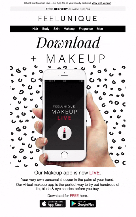
The Use Of Animation
Movement helps prevent email content from becoming too static, which can sometimes be a bit boring. To bring movement to their email content, many brands are using animated GIFs. Just be careful about their size since they can slow down the loading time a bit — especially on mobile devices.
The Use Of Infographics
If you need to convey a lot of information to your readers, then infographics are an excellent way to do so. Infographics are visually effective because they allow you to carefully organize your information in a manner that is easily digestible. Infographics are also much more pleasant to look at visually speaking than having to read through a list or table full of statistics.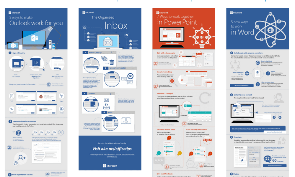
An Emphasis On Color Use
Many brands use color in their emails, but don’t give a lot of thought into how they use it. Bold color choices can help you bring attention to different components of your email, whether it’s highlighting a product or emphasizing your call-to-action. The careful selection of color can also help you tie the entire aesthetic of your email together into a more cohesive design.
The Use Of Monochrome
Monochrome email designs make use of greyscale in order to create a more sophisticated and elegant look. However, don’t be mistaken into thinking monochrome just means black and white. Black and white email designs look boring, whereas monochrome requires the careful consideration of various shades of gray along with black and white to create high contrast visual elements.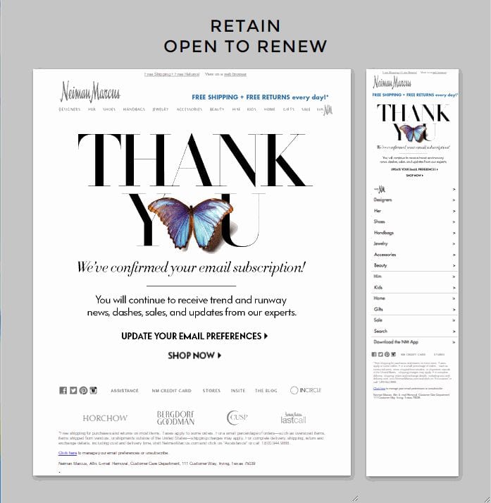
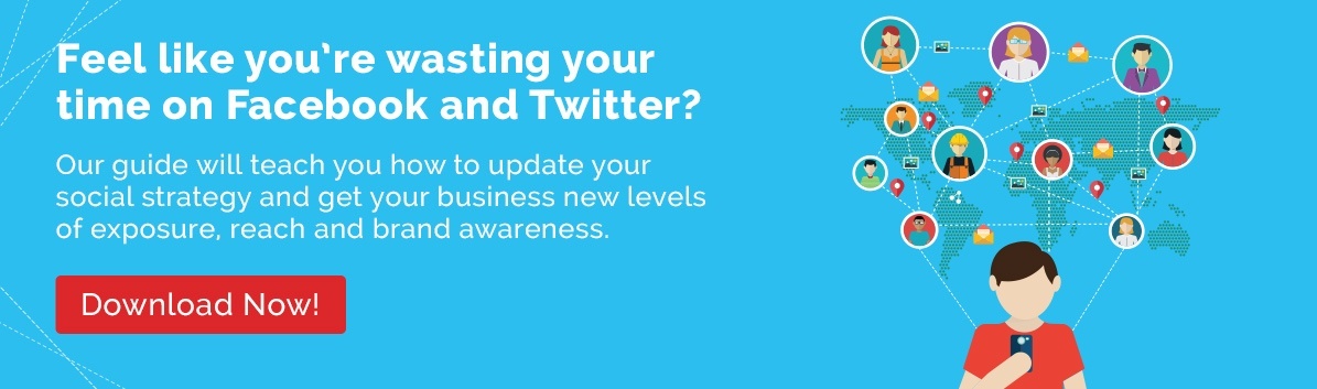
Minimalistic Designs
You don’t want an email design that’s too busy and cluttered or else it will overwhelm the reader. A more minimalistic design will not only make it easy for readers to scan your content, it creates a more elegant appearance when pulled off properly. Minimalistic designs often make strategic use of negative space to bring attention to headlines or images. It also tends to create a more professional impression of a brand.
Keeping up with the latest email design trends is a good way to ensure that your email designs don’t get stale. These are some of the current email design trends that you should consider adopting for your email marketing campaign this year.

Terry offers over 15 years experience providing web, video design/production and print, as well as marketing and advertising. Battle-tested with regard to client needs. Diversity and understanding in skill set, constant exploration of new technologies, and a passion for personal education. Proven competence and knowledge in the entertainment, healthcare, beauty, sports and real estate industries.