
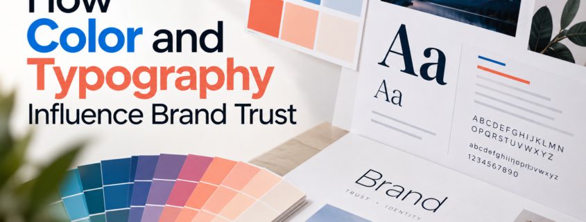
The Psychology Behind Colors, Typography and Trust
People form impressions of a brand before reading every word on its website.
Color psychology and typography in branding influence how customers perceive a business before they fully engage with its messaging or products. Together, these visual choices help establish brand personality, improve recognition, and shape the overall customer experience.
Colors, fonts, images, and layout all contribute to how a business presents itself. These design choices can make a brand feel familiar, professional, approachable, or difficult to understand.
But building trust through design involves more than choosing the right color.
It requires consistency, readability, and an understanding of the audience.
How Color Psychology in Branding Influences Brand Perception
Color helps establish a brand’s visual identity and can influence how people interpret its personality.
For example, a healthcare organization might choose a calm, restrained palette, while a children’s entertainment brand might prefer brighter colors.
That does not mean one color always produces the same emotional response.
People interpret colors differently depending on personal experience, culture, industry, and context.
The most useful question is whether the colors fit the message the business wants to communicate.
Typography Changes How a Message Feels
Typography is not simply about choosing an attractive font.
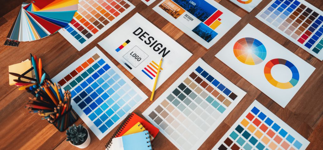
It affects readability and the overall character of a brand.
Typography psychology explores how typeface styles, spacing, and presentation can influence perceptions of a brand’s personality and professionalism.
A traditional serif typeface may communicate a different personality than a modern sans-serif font. Neither is automatically more trustworthy.
The right choice depends on the audience, brand positioning, and where the text will appear.
Typography should also create a clear hierarchy so that visitors can distinguish headings, supporting information, and calls to action.
Design Choices That Can Support Trust
| Design Element | Why It Matters |
| Consistent brand colors | Helps customers recognize the business |
| Readable typography | Makes important information easier to understand |
| Clear visual hierarchy | Helps visitors find answers quickly |
| Strong color contrast | Improves readability and accessibility |
| Consistent buttons and navigation | Makes the website easier to use |
| Authentic photography | Helps visitors see real people, places, or products |
These elements work together. A website may use attractive colors but still frustrate visitors with small text or confusing navigation.
For example, a B2B company might use a consistent color palette, readable typography, clear headings, and authentic photography of its team or facilities. Together, these choices can help communicate expertise while making complex services easier for potential customers to understand.
Why Readability Matters More Than Decoration
A common design mistake is prioritizing appearance over readability.
Light gray text on a white background may look subtle, but it can be difficult to read.
Similarly, decorative fonts may work for short headings but become tiring in longer paragraphs.
When customers struggle to read or navigate a website, they may leave before learning what the company offers.
The connection between website design and trust becomes especially important here. Readable content, accessible layouts, and intuitive navigation help visitors find information without unnecessary frustration, creating a more reliable and user-friendly experience.
Good design removes that friction.
Consistency Makes a Brand Easier to Recognize
Imagine receiving an email from a company and then visiting its website, only to find different colors, fonts, and messaging.
That inconsistency can create uncertainty.
A consistent visual brand identity helps customers recognize a brand across advertising, social media, websites, and printed materials.
It also gives the company a clearer, more professional presentation.
Maintaining consistent design elements across these channels reinforces familiarity and helps customers feel confident that they are interacting with the same business.
How to Review Your Own Brand Design
Start with a few practical questions:
- Are our brand colors used consistently?
- Is website text readable on mobile devices?
- Do headings help visitors scan the page?
- Are our photos relevant and authentic?
- Does the design match our positioning?
- Are important actions easy to identify?
Color and typography are important, but neither can replace reliable information, good service, or a strong customer experience.
The best brand design brings those elements together.
CTA: Does your brand design reflect the business you’ve become? Stevens & Tate can help you review your visual identity and create a more consistent brand experience. Let’s create a design your customers can trust. Get in touch!
FAQs
Q1. How does color psychology influence branding?
Color psychology examines how colors affect perception and emotional responses. In branding, colors can help communicate personality and improve recognition, but their meaning depends on the audience, industry, and cultural context.
Q2. How does typography affect brand trust?
Typography affects how easily people read information and how they perceive a brand’s personality. Consistent, readable fonts can create a more professional and reliable experience across websites and marketing materials.
Q3. What colors build the most trust in website design?
No single color guarantees trust. Blue is commonly associated with reliability in some branding contexts, but customer trust depends on more than color. Clear information, accessible design, consistency, and credibility also matter.
Q4. Why is visual consistency important for branding?
Visual consistency makes a business easier to recognize across websites, advertisements, social media, and other channels. Using consistent colors, typography, and design elements helps create a familiar brand experience.

Terry offers over 15 years experience providing web, video design/production and print, as well as marketing and advertising. Battle-tested with regard to client needs. Diversity and understanding in skill set, constant exploration of new technologies, and a passion for personal education. Proven competence and knowledge in the entertainment, healthcare, beauty, sports and real estate industries.