5 Unique Household Packaging Designs You’ll Never Expect
Mark Beebe | October 23, 2013 | Stevens & Tate
Have you ever heard the phrase “Don’t judge a book by its cover?” These days product packaging has become so intricate and unique that it can entice customers to purchase the product. The new wave of product packaging and design has a big impact on sales. You could put every piece of product in a brown box and call it a day; this is why product packaging takes much deliberation and creativity to get it perfect. Who knows, maybe the packaging alone could be the driving force of the sale.
1. NYC Packaging of Spaghetti
This packaging of spaghetti noodles is so simple, crisp, and clean that it is almost like a breath of fresh air to see something this creative. At first glance of this product with the lid on one could think that this is just a plain box of uncooked pasta, but to have the design on the inside in brilliant. The coloring and the text on the box completes this product packaging. What’s the next building they could make out of this Italian staple?
2. Pistachios with Sea Salt
Whenever I hear the word “pistachio” I think of the commercial with a celebrity and how they crack open their pistachios, the packaging of this brand of pistachios is clever. Fun fact: the pistachio actually grows on a tree and is a part of the cashew family. What better of a way to package pistachios then to put them in a giant pistachio container? This brand deserves a round of applause for their packaging, well done.
3. The Saucy Fish Company
This specific company has a very interesting way of packaging their freshest fish. They package their product in this sleek black packaging for a reason. It makes the fish look brighter and appetizing. The unique element of this packaging is that the company started to put in a complementing sauce packet. So not only do you get a beautiful piece of fish, you can now get a delicious sauce without having to wonder if it will taste good together. And with 18 different flavors who wouldn’t want to sink their teeth into this fish?
4. Hanger Tea
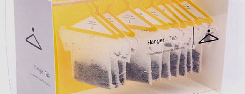
Normal tea boxes just are not too visually appealing these days. Have you heard of Hanger Tea? They decided to turn their tea box into a mini closet. And the kicker, hanging their teabags on tiny hangers. That is probably one of the most creative things thus far. This is a perfect way to incorporate the brand name with the actual product that they are trying to sell. Hanger Tea might be hard to find in your local grocery store for this reason alone: the packaging is amazing.
5. 321 Filtered Water Bottle
If you walk down the exercise or kitchenware aisle you will most likely see a few dozen different types of water bottle claiming they are eco-friendly, and have filters. Well this specific water bottle is definitely not an eyesore. This packaging is so different customers are just going to go crazy for this. The filter part could have just been boring like the rest of the filters on the market, but instead the company who designed this bottle thought a little outside of the box on this one. The entire bottle is so sleek and modern and yet so enticing to buy.
To conclude with, more and more companies are taking the creative route when putting thought into the design for packaging their products. These are just five of the many different packaging that are unique and eye catching. You may see more of this clever packaging in the next few years. One question just remains, what will they think of next?

Mark Beebe oversees all current clients. His secondary focus is leading the creative with original thinkers who provide innovative processes and insightful answers for clients’ marketing needs. His 30+ years has garnered the team to over 50+ national and international awards. As a partner, Mark, looks for unusual solutions to bring smart results and metrics to your bottom line.


