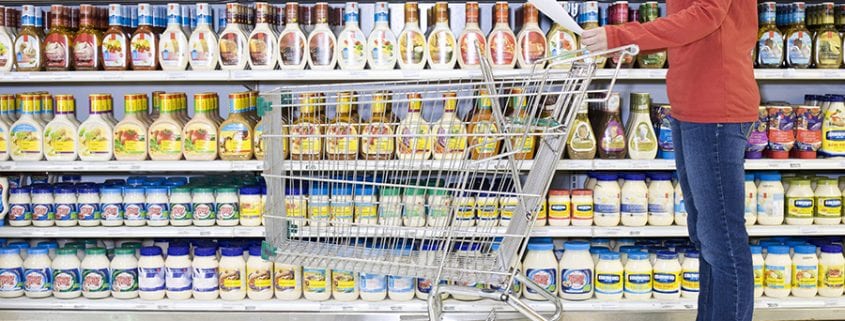
5 Package Design Trends for 2018
Change happens quickly, and if you are caught unawares, you could be left with packaging that is outdated and stale. Recognizing and incorporating the following package design trends into your packaging ensures that your packaging is modern and beneficial to your image.
1. Minimalism
Minimalism, the use of elegant, streamlined, and visually simple packaging, never really goes out of style. There are numerous ways to achieve a minimalistic look, including using bold typography contrasted with stark white backgrounds, splashes of color on clean backgrounds, or a basic arrangement of simple shapes. If you incorporate this year’s top colors, including pink, purple, and color of 2018 PANTONE® 18-3838 Ultra Violet, you can make your minimalistic design modern and timeless, without isolating or overwhelming the viewer.
2. Go Bold
Color has always played an integral part in developing packaging and this year is no different. Use bold colors to evoke emotional responses in potential consumers and, consequently, impact their buying decisions. So, the primary color you use in your package design has a significant psychological effect on those viewing it, and you should choose it carefully. Be bold, but choose colors that represent the personality of your brand.
3. Handwriting and Handmade
Many consumers are looking for environment-friendly and ethical goods, including homemade items. Homemade products also create an emotional connection with the consumer, often evoking warm memories and nostalgia. The handmade package feel can be achieved through careful package design that includes text that looks handwritten. However, it is essential to ensure that your writing is clear and readable. You do not want to confuse or inadvertently mislead consumers.
4. Whimsy
Most consumers love goods that evoke positive childhood memories, or that engage their inner child. Using fun visuals, bright colors, and fantastic illustrations, including hand-drawn logos, is a great way to engage such consumers. Whimsy makes people smile and feel happier, so when your product packaging incorporates whimsy, you are creating this joyful connection between your customer and your product.
5. Eco-friendly
Going green is the best way to gain new customers and keep returning ones. It is not enough for your product to have eco-friendly credentials though; your packaging has to as well. Using packaging materials that are eco-friendly, biodegradable, and locally sourced is a great place to start. However, your design must also shout eco-friendly. Using earth-based colors in your packaging is one step, as are the inks you use in printing and the amount of packaging you use.
Incorporating these package design trends into your packaging will benefit your business in 2018. However, it is also important to employ them in a way that maintains your individuality and ensures that you are instantly recognizable to your audience, so using the same color scheme as you use in the rest of your marketing can be a great start.

Mark Beebe oversees all current clients. His secondary focus is leading the creative with original thinkers who provide innovative processes and insightful answers for clients’ marketing needs. His 30+ years has garnered the team to over 50+ national and international awards. As a partner, Mark, looks for unusual solutions to bring smart results and metrics to your bottom line.


