Logo Design Trends For 2018
Your business logo encapsulates your business. In one simple graphic, your potential customers learn everything they need to know about you. Logo design done right embodies your brand, makes you instantly recognizable, and creates a timeless appeal.
One of the critical mistakes that businesses of all sizes make when designing their logo is following the wrong trends. Another is following trends too tightly, and not adding that spark that makes them stand out from the crowd. Do you remember when everyone decided to include pixilated images in their logo? But, can you name any of the individual companies that tried that?

Think Social Media
One of the key trends for logo design in 2018, is designing with social media in mind. Logos on social media need to be short, punchy, and fit neatly into a square field. That does not mean that square logos are the way forward; it just means that the finished logo should fit, and be visually balanced, within a square.
 Considering Context
Designing your logo is not just about the logo itself, but also how it is presented to your potential audience. One trend that is gaining momentum, and which is likely to continue to do so into 2018, is placing your logo in a real-world context. That includes ideas such as showing the logo on wall signage, business cards, and stationery. Taking this approach creates a visual link with the audience, so when they then see your signage with your logo, they automatically think back to what they have seen, and read about that logo and therefore that brand.
Mindful Monograms
Monograms and single letter logos are ideal for social media. They play on a classic idea that has been placed on everything from letterheads to cufflinks for centuries. However, it can be challenging to make monograms and letter logos unique. If you are going to use your business initials to create your monogram, then be watchful of unintended words, shapes, and puns that can be created.
Making this type of logo stand out, and say something meaningful about your brand, can also be difficult. Colors, shapes, letter styles, and letter combinations need to be well chosen to ensure that you do not create a logo that looks just like everyone else’s.
Going Back to Basics
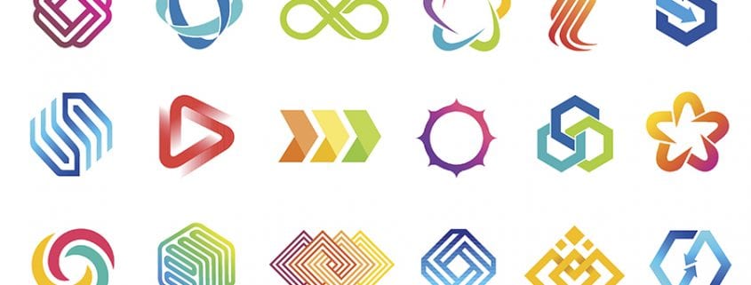
Logos that include geometric shapes and clean lines are set to be on trend in 2018. These logo designs come back into favor regularly because they are, when done right, elegant and timeless. However, you need to avoid these types of logos becoming over simplistic and boring. You also need to ensure that your logo design stands out; after all, there are only so many shapes and shape combinations that can be used to create a geometric design.
Bringing Back Color
Working in a digital medium gives you unprecedented access to colors in tones and shades that have been near impossible to create or show in a logo before. This is one of the reasons why there has been a surge towards brightly colored logos. However, when using color, it is not enough to just use blocks of bright, intense colors. To stand out, your logo design needs to consider intensity, saturation, shades, fading, and mixing of colors. Moreover, the colors you use must still reflect your business and its brand.
Logo design trends are there to guide you in creating the perfect logo. However, the focus of your logo design must remain on designing a logo that represents your business positively and makes you both visible and memorable.

Mark Beebe oversees all current clients. His secondary focus is leading the creative with original thinkers who provide innovative processes and insightful answers for clients’ marketing needs. His 30+ years has garnered the team to over 50+ national and international awards. As a partner, Mark, looks for unusual solutions to bring smart results and metrics to your bottom line.


