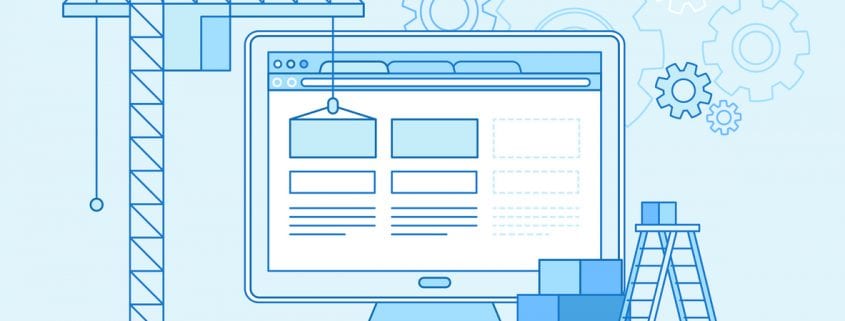
6 Web Design Principles to Increase Conversions
Putting thought into your web design is a must if you have any ambitions to grow your business. While the content that you host on your site and the strength of your SEO strategy will help you attract leads, your web design will play a big part in your ability to convert leads. Keeping that in mind, the following are six web design principles for conversions:
1. Use A Responsive Design
If you’re not using a responsive design, it means that although your website may load properly on desktops, it may not be displayed correctly on smaller screens, such as those on smartphones and tablets. If your website doesn’t load properly on a smartphone, it will require the user to not only scroll up and down but also left to right — and to zoom in and out. Few mobile users will have the patience to deal with a site like this, which will lead to a significant bounce rate. Use a responsive design so that you don’t lose your mobile leads.
2. Ensure That Your Pages Load Quickly
Even if your site does load properly, few visitors will have the patience for pages that load slowly. It should take no more than one to two seconds for your site to load. If it takes three or more seconds, you’re in trouble. Leads will get frustrated and will likely abandon your site. Test your page speeds to ensure that they load quickly.
3. Don’t Include Too Many Choices
Too many choices can make it difficult for visitors to figure out what they want or to find what they’re looking for. For example, a navigation menu is a great addition. It lets visitors find your blog, contact page, product page, etc. However, if you fill up that navigation menu with dozens upon dozens of links, it becomes overwhelming. Not only will it actually be more difficult for visitors to find what they’re looking for, but too many choices requires them to commit more of their time to make a decision. To capture leads, you need to help guide their decision making–offering too many choices does the opposite. Keep it simple.
Why are call-to-action phrases so important? Learn more by clicking here!
4. Use Negative Space
The visual design of a page should be kept relatively simple to prevent visitors from becoming overwhelmed. The last thing you want is a page covered in text, links, images, videos, and more. This makes it hard to find anything amidst the clutter. To avoid this, make sure that there’s plenty of negative space throughout each page. Negative space helps reduce clutter, gives your site a clean and elegant look, and makes your page easier to scan.
5. Choose Colors Carefully
The way you use color is psychologically important. Colors evoke different emotions and reactions from your visitors. For example, blue indicates trust, which is why it’s a color often used for CTA buttons. However, the colors you choose should reflect the content on your page as well as your brand in general. Just make sure you keep your colors consistent and that you don’t go overboard using colors. You should stick to a few main colors and their variations. Typically, it’s best if you choose one color along with a second that offers some contrast.
6. Use An F-Layout
Studies have shown that the attention of users is focused in an F-pattern. This means that when they first come to a page, they will be most focused on the top left and top right parts of your page. This slowly diminishes as they work their way down, which means the bottom right of a page gets the least amount of attention. Designing your pages so that they display information in an F-layout is therefore a good way to ensure that the information you want to convey is consumed by your visitors. For example, having the bulk of your content on the left side, positioning important links on the top right side, and then adding your CTA to the bottom left will create an effective F-layout.
The design of your website is essential to not only keeping your visitors engaged, but to keep them on your website for as long as possible. The longer you’re able to keep your visitors on your site, the better of a chance you have of converting them. These are six web design principles for conversions that you should consider implementing.


Terry offers over 15 years experience providing web, video design/production and print, as well as marketing and advertising. Battle-tested with regard to client needs. Diversity and understanding in skill set, constant exploration of new technologies, and a passion for personal education. Proven competence and knowledge in the entertainment, healthcare, beauty, sports and real estate industries.