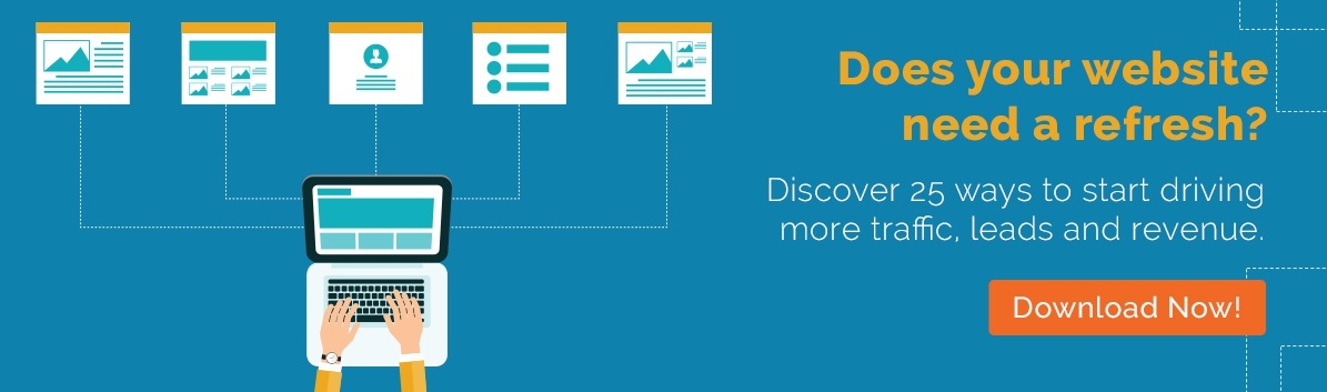
Top 5 Critical Website Redesign Analytics Tools
Your website is the most important marketing tool you have—so it’s no surprise that its design is essential to your success. However, both technology and user behavior are constantly evolving. As such, you need to update your website to stay ahead of the curve. If your website is more than a few years old, it may be time for a website redesign.
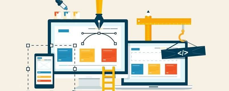
The Benefits of Redesigning Your Website
Unless your website is completely broken, you may wonder if it’s worth it to invest money and resources into a website redesign. This is especially true if it seems like your website is performing just fine. The following are a few major reasons why you need to redesign your website:
1. Improve The User Experience
If your website is outdated or difficult to use (due to poor technical SEO or poor design), it can cause a poor user experience. As a result, visitors may not stay on your site for very long. A redesign can make your site more user-friendly and easy to navigate. As a result, it will keep visitors on your site longer and encourage them to come back.
2. Increase Web Traffic

If your website is outdated or not optimized for search engines (such as through SEO or mobile optimization), you won’t get as much traffic as you could. A redesign can help improve your site’s ranking and make it more visible to potential visitors. The more visitors you get, the better a chance you have of generating more leads.
3. Enhance Branding
If your current website does not reflect your brand well, a redesign can help to better align your website with your brand. This is especially important if your business recently underwent rebranding. It’s critical that your website reflects your branding in terms of both the look (such as the logos, colors, and fonts) and the messaging. If it doesn’t, it can confuse visitors, thereby hurting your brand identity and your ability to convert leads.
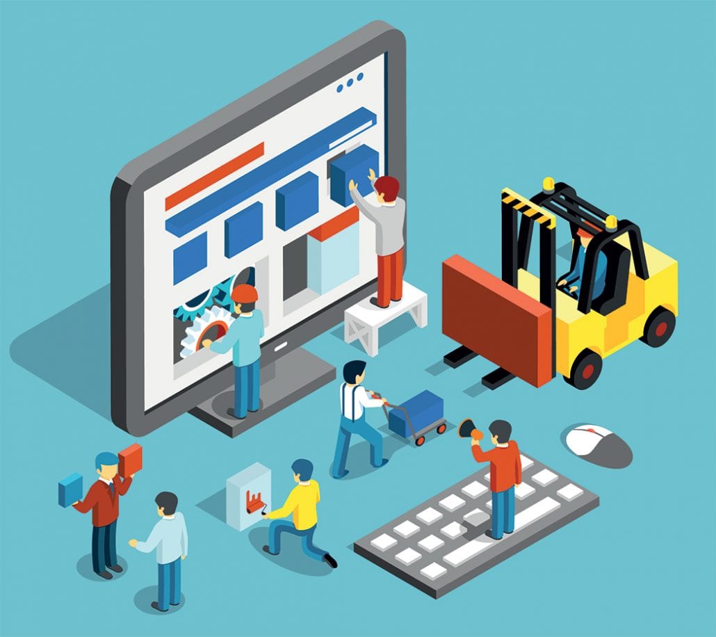
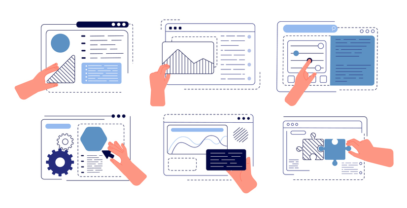
Website Redesign Analytic Tools You Should Use
If it’s been a while since you built or redesigned your website, then you should do a comprehensive audit to determine if your site need work. The following are five analytic tools that can help guide your website redesign:
1. Google Analytics
Google Analytics is a free tool that provides a wealth of data about your website visitors. This data includes how visitors found your site, what they did, and whether or not they converted. This data can help you understand what you need to improve. For example, you can use Google Analytics to see which pages on your site are the most popular and which ones have the highest bounce rate.
2. Crazy Egg
Crazy Egg is a heat mapping tool. It lets you see how users interact with your website. This includes where they click, how far they scroll, and where they abandon your site. This data can help you understand what users are looking for on your site and where they are getting stuck. It can also help you to determine what parts of your website you need to redesign to improve the user experience.

Read About “The Website Redesign Process- Why Content Comes First?”
3. Screaming Frog
Screaming Frog is a tool that crawls websites and shows you how search engines see your website. It can help you identify technical SEO issues, such as broken links and duplicate content. It can also help you evaluate your website’s structure and identify issues that are causing problems with search engine crawlers.
4. Google’s Mobile-Friendly Test
Google’s Mobile-Friendly Test is a tool that allows you to see how well your website is optimized for mobile devices. If your website isn’t mobile-friendly, then you’re losing potential visitors because your site isn’t loading properly on smaller screens. This data can be extremely helpful in understanding what needs to be fixed to make your site more mobile-friendly.
5. Semrush
Semrush is a tool that allows you to see how well your website is performing in search engines. This includes understanding your organic traffic, the keywords you’re ranking for, and your backlink profile. This data can be extremely helpful for identifying what you need to do to improve your visibility in search engines. You can also use Semrush to see which keywords you’re not ranking for that you should be, and which competitors are outranking you.
These are just a few of the many different analytic tools that you can use to assess your website’s performance. By taking the time to understand what’s working and what isn’t, you can improve your website’s design, functionality, and performance.


 3. Focus on Customer-Centric Website Design
 6. Clean Up SEO and Enhance Accessibility During Your Website Redesign