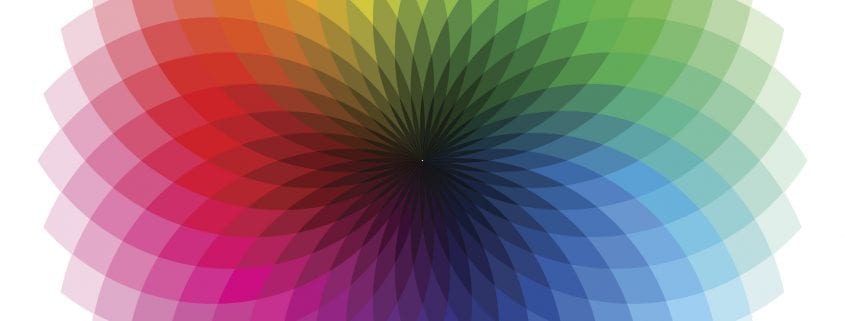
The Psychology Behind Color Choices in Branding and Marketing
Color is one of the most powerful and underestimated tools in branding and marketing. Long before consumers read a slogan or understand a product’s features, they feel something often because of color. In fact, studies show that people form subconscious judgments about a brand within seconds, and color plays a key role in that decision. This is why color choices in marketing play a critical part of any emotional branding strategy. Helping brands connect with audiences on a deeper, psychological level. Learn how Stevens & Tate helps brands build deeper connections through integrated marketing and design—where color, messaging, and brand experience all work together to tell a cohesive story.
Why Color Psychology Matters in Branding and Marketing
Branding and Color psychology explore how distinct colors influence human emotions, behaviors, and feelings. In branding, the goal is not just to look attractive but to communicate values, personality, and trust instantly.
An effective emotional branding strategy uses color to:
- Evoke specific feelings (comfort, excitement, confidence)
- Shape brand perception
- Increase brand recognition
- Influence purchasing decisions
When color aligns with brand identity, it strengthens emotional bonds and builds long-term loyalty. When it is misaligned, it can create confusion or even distrust. This is why leading agencies like Stevens & Tate do not treat color as a purely aesthetic choice. Instead, they approach color as a strategic tool-one that supports brand positioning, audience psychology, and long-term marketing goals.
Understanding Emotional Responses to Color
Here’s how different colors play key roles in emotional responses:
1. Primary Colors and Their Psychological Impact
Primary colors such as red, yellow, and blue are incorporated for different goals; for instance:
- Blue conveys trust, intelligence, and unmatched stability. Plus, it’s widely used by various professional service brands that want to signal top-notch reliability and authority among the audience.
- Red is usually considered a timeless color for urgency, passion, and boundless excitement, helping drive a certain action along with higher emotional intensity.
- Yellow represents a perfect balance of optimism and warmth, creating feelings of both friendliness and accessibility at once.
Moreover, these colors become way more effective when combined into highly cohesive emotional branding strategies that prioritize aligning high-quality visuals with messaging and customer experience in the long run.
Color Consistency and Brand Recognition
Consistency is key. Using the same color palette across logos, websites, packaging, and advertisements increases brand recognition and reinforces emotional responses over time. When consumers repeatedly associate certain colors with a brand experience, those colors become emotional triggers. Instantly recalling trust, excitement, or comfort tied to the brand. Strong brands do not just choose colors, they own them. That ownership is built through consistent, strategic use across every touchpoint. This is a key pillar of both brand color psychology and effective emotional branding in marketing.
How to Choose the Right Colors for Your Brand
To develop an effective emotional branding strategy through color:
- Define your brand personality and values
- Understand your target audience’s emotions and expectations
- Research competitors and industry standards
- Test color combinations for emotional impact
- Maintain consistency across all platforms
Color is far more than a visual choice it is a psychological tool that shapes feelings and drives emotional connection. When used thoughtfully, color strengthens brand identity, builds trust, and influences consumer behavior. By integrating color psychology into an emotional branding strategy, brands can create meaningful, lasting relationships with their audiences and stand out in an increasingly competitive market. This is exactly where Stevens & Tate excels. Through integrated marketing and design, they help brands ensure that color, content, and strategy work together to create stronger emotional connections and more meaningful brand experiences.
The Role of Color Beyond Aesthetics

Color psychology is broken down into specific emotional impacts. For example, blue is linked to trust and dependability, while green is used to stand for feelings of peace, harmony, and growth. A brands color choice does not just change the aesthetic of its website design . It affects how customers are going to remember that brand and what they are going to associate that company with. By integrating color psychology in branding into a broader emotional branding strategy, companies can move beyond looking good to actually feeling right to their audience. With the guidance of partners like Stevens & Tate, brands can build deeper connections through integrated marketing and design, turning every color, message, and experience into an opportunity to stand out in a crowded market.
Final Thoughts
Mostly, a color is where psychology meets strategies that actually work. Plus, it also shapes how brands are felt, remembered, and even trusted in real-time, not only in presentations. That’s why, with purpose and expert-led planning such as Stevens & Tate Marketing’s brand development services, color becomes a powerful tool for building as well as nurturing emotional connection and long-term growth for brands.
Ready to build a brand that effortlessly endures, resonates, and inspires? Then, partner with Stevens & Tate Marketing today to develop a strategic, emotion-driven branding approach that truly transforms colors into long-lasting brand equity!
FAQ’s
1. How does color influence emotional branding strategy?
Color simply triggers subconscious emotional responses that eventually help brands create instant connections before logic or messaging can even take effect.
2. What role does color play in sustaining emotional brand equity?
Consistent, meaningful color incorporation helps build trust, familiarity, and long-term emotional recognition over time.
3. Can color choices impact brand credibility?
Yes, professional color palettes, when used consistently, boost perceived authority and trustworthiness among the audience.
4. Why do leading brands avoid frequent color changes?
Frequent changes can easily disrupt overall emotional memory and even weaken brand recognition in the long run.


