How to Use Color Psychology in Marketing
When it comes to building your brand, don’t underestimate the importance of color. The colors you choose are crucial to your brand identity. Just think about some of the most famous brands out there and the colors associated with them, such as Nike and black, Starbucks and green, and Target and red, just to name a few. The colors you choose will always be associated with your brand, which is why you need to choose them carefully (and why they need to remain consistent across all of your branding efforts). One of the most important things to keep in mind is that color isn’t just an aesthetic choice, it’s a psychological one too.
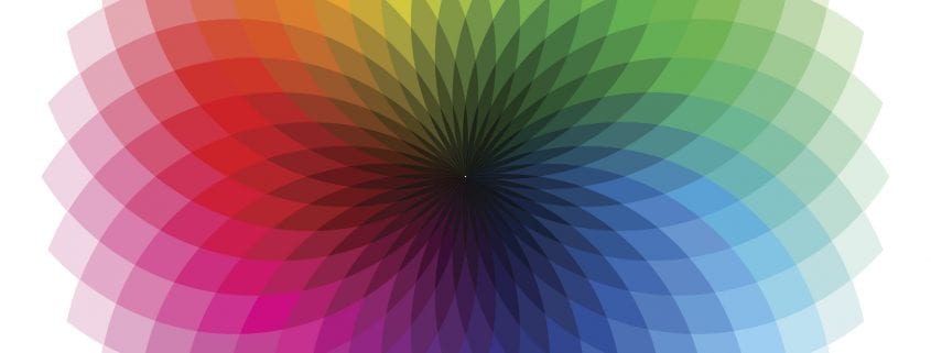
The Power of Color: How to Use Psychology in Marketing
Using Color Intentionally
There are two primary ways to use color in your marketing efforts. The first is to make certain marketing elements stand out. For instance, adding a colored call-to-action button at the end of a blog post instead of using regular anchor text. If the button stands out from the background, it will immediately draw the eye of the reader so that they don’t miss out on your CTA.
The colors you choose for your website’s background and text is crucial as well. Not only does it impact the overall aesthetic of your website (which is important as it reflects on your company’s professionalism), but it also affects the ease of use. If you use two colors that are too similar (such as yellow text on an orange background) it becomes incredibly difficult for visitors to navigate your site. Your color choices should provide enough contrast so that foreground elements stand out from the background.
Finally, don’t overuse color. For example, choosing to use five different colors throughout your home page will create visual clutter that will overwhelm visitors. It works better if you choose no more than two colors that combine to create visual balance.
What Every Creative Advertising Agency Needs To Know To Endure The Digital Transformation
Using Color Psychology
Different colors elicit different feelings. By using certain colors, you can engage your audience by making them subconsciously feel a different way. Most successful brands choose their colors based on this idea. Take for example McDonald’s. As everyone knows, they use two colors: red and yellow. They complement one another aesthetically and are chosen for their psychological meaning. Red is often associated with friendliness, while yellow is associated with happiness, both of which are emotions McDonald’s embraced as a major part of their brand voice. Red also happens to be a very stimulating color that’s meant to trigger feelings of hunger. Combined, they attract attention from hungry customers.
Also Read: The Strategic Difference Between Branding and Marketing and How They Work Together
Color Breakdowns
All colors have some sort of effect on the psychology of consumers. With that in mind, the following are a few of the different colors you could use in your branding and the psychological meaning behind them:
- Orange – Orange is associated with physical comfort, motivation, and positivity. Payless Shoes and Home Depot use orange as their primary color for these reasons.
- Green – Green represents harmony, peace, health, and growth. Financial institutions use green to promote growth (of wealth), while many health products and stores use green to promote health (such as Whole Foods).
- Blue – Blue is closely linked to trust and dependability. Many technology companies use blue to promote the idea that their products are dependable, such as Dell, GM, and Honda. Companies like Facebook and All-State also use blue to promote trust.

- Brown – Brown is used to create feelings of trust and security. It’s why UPS prominently uses the color for everything, including their uniforms and trucks.
- Purple – Purple is associated with luxury and royalty, which is why brands that promote their products as luxurious use purple, such as Cadbury, Hallmark, and Louis Vuitton.
- Pink – Pink represents compassion, love, and empathy. Pepto-Bismol and Victoria’s Secret both use pink to this effect for different reasons.
Choose Your Colors Wisely To Improve Your Marketing Efforts
As you can see, the use of color is incredibly important to your marketing efforts. Not only do your color choices affect the aesthetic of your website (as well as its ease of use), they are also vital to defining your visual identity. As such, be sure to choose your colors carefully as they will have a psychological impact on your audience.