What’s New With Google Analytics – How To Measure Your Audience

Google Analytics is one of the main tools that you should be using to track audience metrics because of the in-depth information it provides as well as the regular updates that Google makes to the continually improve the program. In fact, Google has already implemented several upgrades this year that will help provide you with more data concerning your website’s visitors that allow for more comprehensive user reports. Learn what’s new with Google Analytics by checking out the following updates made in 2018 so far:

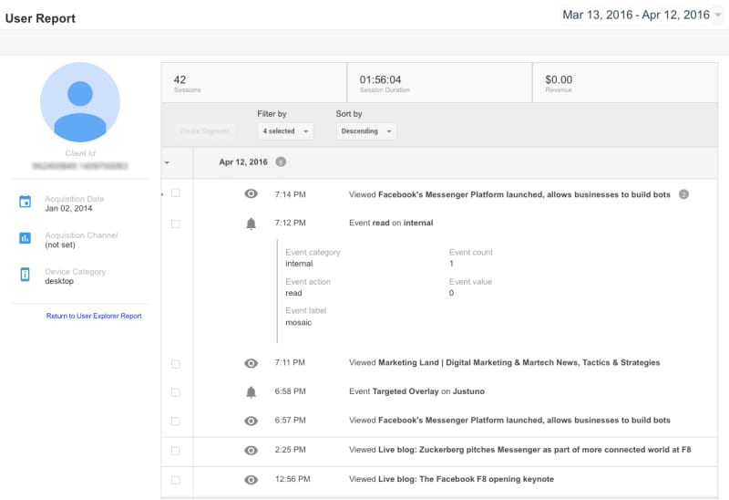
1.  User-Focused Reporting

User-Focused Reporting is an update to the standard reporting provided by Google Analytics and can also be used in Lifetime Value, Cohort Analysis, and Active Users. The feature allows companies to look more closely at users who visit their websites multiple times instead of only being able to see the total number of sessions.
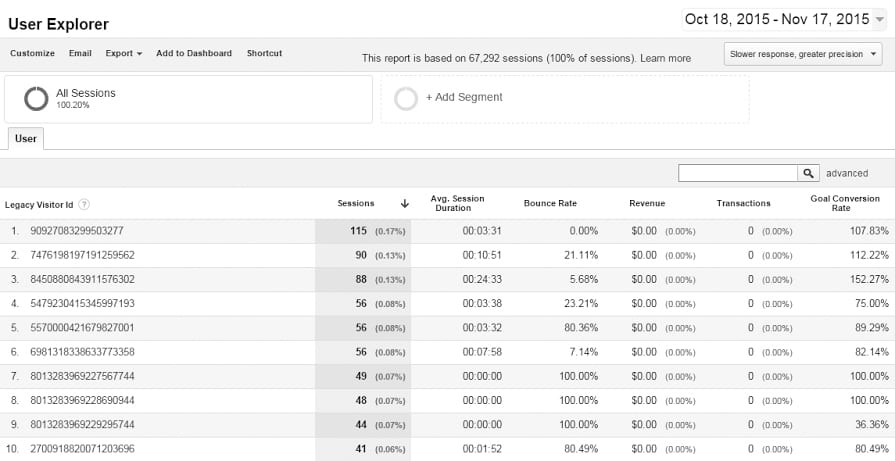
what's new with google


2.  User Explorer

User Explorer is a feature that provides detailed information for the top 10,000 users dating back to 2016 based on the life of their cookies. This data, which includes metrics such as bounce rate, revenue, amount of sessions, the average duration of sessions and transactions, can be incredibly useful.

what's new with google


3.  Audience Reporting

Audience Reporting is a feature that allows you to segment or target display campaigns in AdWords. Previously, there was no way to publish an Audiences Report in Google Analytics. This has changed with this update, allowing you to add them as a secondary dimension in custom reports, custom funnels and segments, thereby allowing marketers to view a cross-channel view of them.

what's new with google


4.  Conversion Probability

Conversion Probability is one of the most useful new tools that can be used in Google Analytics. Basically, it uses the data a company has on its website visitors as well as on past conversions to make a prediction on how likely a user will be to convert in the future. The Conversion Probability feature designates users with a number between 1 and a 100, with 100 being the most likely to convert. Companies can use these numbers to identify which users are worth remarketing to.

what's new with google


Learn more about what’s new with Google here!

Knowing what’s new with Google makes it easier for companies to track helpful metrics, thereby giving them the opportunity to make more effective adjustments to their marketing strategies over the course of their campaigns. These are four of the updates that Google has made to its Analytics tool so far this year.

Learn To Use Social Media To Find New Leads

package design

5 Package Design Trends for 2018

Change happens quickly, and if you are caught unawares, you could be left with packaging that is outdated and stale. Recognizing and incorporating the following package design trends into your packaging ensures that your packaging is modern and beneficial to your image.

1. Minimalism

Minimalism, the use of elegant, streamlined, and visually simple packaging, never really goes out of style. There are numerous ways to achieve a minimalistic look, including using bold typography contrasted with stark white backgrounds, splashes of color on clean backgrounds, or a basic arrangement of simple shapes. If you incorporate this year’s top colors, including pink, purple, and color of 2018 PANTONE® 18-3838 Ultra Violet, you can make your minimalistic design modern and timeless, without isolating or overwhelming the viewer.

2. Go Bold

Color has always played an integral part in developing packaging and this year is no different. Use bold colors to evoke emotional responses in potential consumers and, consequently, impact their buying decisions. So, the primary color you use in your package design has a significant psychological effect on those viewing it, and you should choose it carefully. Be bold, but choose colors that represent the personality of your brand.

3. Handwriting and Handmadepackage design

Many consumers are looking for environment-friendly and ethical goods, including homemade items. Homemade products also create an emotional connection with the consumer, often evoking warm memories and nostalgia. The handmade package feel can be achieved through careful package design that includes text that looks handwritten. However, it is essential to ensure that your writing is clear and readable. You do not want to confuse or inadvertently mislead consumers.

4. Whimsy

Most consumers love goods that evoke positive childhood memories, or that engage their inner child. Using fun visuals, bright colors, and fantastic illustrations, including hand-drawn logos, is a great way to engage such consumers. Whimsy makes people smile and feel happier, so when your product packaging incorporates whimsy, you are creating this joyful connection between your customer and your product.

5. Eco-friendly

Going green is the best way to gain new customers and keep returning ones. It is not enough for your product to have eco-friendly credentials though; your packaging has to as well. Using packaging materials that are eco-friendly, biodegradable, and locally sourced is a great place to start. However, your design must also shout eco-friendly. Using earth-based colors in your packaging is one step, as are the inks you use in printing and the amount of packaging you use.

Incorporating these package design trends into your packaging will benefit your business in 2018. However, it is also important to employ them in a way that maintains your individuality and ensures that you are instantly recognizable to your audience, so using the same color scheme as you use in the rest of your marketing can be a great start.

Download Our White Paper Guide To Learn How To Perfect Buyer Personas For Your Business

Top Graphic Design Trends for 2018

With a substantial number of companies turning to the internet to market their businesses, it is harder to stand out from the crowd than ever before. However, knowing the graphic design trends that are most likely to occur in 2018 can put you ahead of the game.

1. Color Is Key

The key aspect of all elements of graphic design in 2018 is color – from multiple brand color schemes to the return of color gradients and the use of unusual color combinations. The colors you choose this year could make or break your web presence. The multiple brand color approach is already being piloted by companies like Dropbox. Rather than change their familiar and instantly recognizable logo, they introduced a new range of official brand colors including pink and purple, which are set to be central colors in design this year. It is worth noting that color of 2018 is PANTONE® 18-3838 Ultra Violet.

2. Image Authenticity

There has been a move away from stock images over the past few years, with businesses realizing that visitors and customers wanted and trusted authenticity. This move will increase this year with the winning pictures being carefully chosen, purposefully created, and impactful. Images that include photos of real people, which are really connected to your company are going to be essential, especially when it comes to your social media presence.

3. Think Fonts


In your written content, the focus of your font choice needs to be on providing a quality reading experience. However, the fonts you use in your design have multiple other purposes. One of these is to encourage an individual to stop scrolling and find out what you are all about. Graphic design trends for 2018 include using handwritten and bold fonts to create eye-catching features. Of course, color comes in here as well; fonts can be colorful, as long as the color engages and intrigues your visitor.

4. Getting to Grips with GIFs

GIFs are quite literally everywhere. While they are great fun, it is hard to see how they can be used seriously within your graphic design. However, while the GIFs you regularly share on your personal social media may not be right for the job, it is possible to create them specifically for your needs, website style, and your customer segment.

Design GIF - Find & Share on GIPHY

5. Brutalism Bares All

Although brutalism has been around for a while, it is set to be one of the significant graphic design trends of 2018. Clear lines, bold yet limited colors, and functional typefaces are at the heart of this approach. This striped-back approach does not work for everyone, and it needs to be used carefully, with the question, “Does this fit my brand story?” being repeatedly asked during the design process. Websites that use the brutalist style well include EPIC Ireland, particularly in their headers and menus; Fake Music; and Tennent Brown Architects.

From bright colors and 3D modeling to brutalism and flat graphics, if the trends of 2018 tell you anything, it is that there is no one right way to stand out from the crowd. It is about choosing the typography, color palette, and design approach that best encapsulate your brand, its image, and its story.

Learn The StoryBranding Process


Logo Design Trends For 2018

Your business logo encapsulates your business. In one simple graphic, your potential customers learn everything they need to know about you. Logo design done right embodies your brand, makes you instantly recognizable, and creates a timeless appeal.

One of the critical mistakes that businesses of all sizes make when designing their logo is following the wrong trends. Another is following trends too tightly, and not adding that spark that makes them stand out from the crowd. Do you remember when everyone decided to include pixilated images in their logo? But, can you name any of the individual companies that tried that?

logo design

Think Social Media

One of the key trends for logo design in 2018, is designing with social media in mind. Logos on social media need to be short, punchy, and fit neatly into a square field. That does not mean that square logos are the way forward; it just means that the finished logo should fit, and be visually balanced, within a square.


logo designConsidering Context

Designing your logo is not just about the logo itself, but also how it is presented to your potential audience. One trend that is gaining momentum, and which is likely to continue to do so into 2018, is placing your logo in a real-world context. That includes ideas such as showing the logo on wall signage, business cards, and stationery. Taking this approach creates a visual link with the audience, so when they then see your signage with your logo, they automatically think back to what they have seen, and read about that logo and therefore that brand.


Mindful Monogramslogo design

Monograms and single letter logos are ideal for social media. They play on a classic idea that has been placed on everything from letterheads to cufflinks for centuries. However, it can be challenging to make monograms and letter logos unique. If you are going to use your business initials to create your monogram, then be watchful of unintended words, shapes, and puns that can be created.

Making this type of logo stand out, and say something meaningful about your brand, can also be difficult. Colors, shapes, letter styles, and letter combinations need to be well chosen to ensure that you do not create a logo that looks just like everyone else’s.


logo design

Going Back to Basics

Logos that include geometric shapes and clean lines are set to be on trend in 2018. These logo designs come back into favor regularly because they are, when done right, elegant and timeless. However, you need to avoid these types of logos becoming over simplistic and boring. You also need to ensure that your logo design stands out; after all, there are only so many shapes and shape combinations that can be used to create a geometric design.


Bringing Back Colorlogo design

Working in a digital medium gives you unprecedented access to colors in tones and shades that have been near impossible to create or show in a logo before. This is one of the reasons why there has been a surge towards brightly colored logos. However, when using color, it is not enough to just use blocks of bright, intense colors. To stand out, your logo design needs to consider intensity, saturation, shades, fading, and mixing of colors. Moreover, the colors you use must still reflect your business and its brand.

Logo design trends are there to guide you in creating the perfect logo. However, the focus of your logo design must remain on designing a logo that represents your business positively and makes you both visible and memorable.


call to action phrases