
Learning from the Best: 10 Examples of Great Website Design
Building a website is simple. But designing a website that meets all the modern web design requirements and works for your unique customers and business is challenging. Most companies create compelling websites but end up sacrificing performance or the user experience. Others prioritize simplicity and convenience but end up with poorly optimized sites. In the sections below, you’ll explore 10 examples of great website designs to inspire your creativity the next time you design a website.
10 Examples of Great Website Design
1. Dropbox
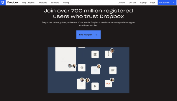
If there’s one website that has done a great job designing a super rsponsive website, it’s got to be Dropbox. This cloud storage and file hosting company has made sure that every site visitor, regardless of the device they use to access the site, enjoys the best navigation, graphics, and content.
Every aspect of the site design, from the font color to the navigation buttons, has been carefully customized for every device, ensuring compatibility and interactive experiences for the varying screen sizes.
For instance, on the desktop, a small arrow directs users to scroll down for more content, helping to minimize the bounce rate. However, this is absent on the mobile version, as users are more likely to scroll down easily.
2. Freshbooks

Freshbooks is an accounting website with one of the best homepage designs, thanks to the simple and minimalist copy, inspiring visuals, and the strategic use of white space in web design. The site also uses a perfect blend of colors with easy-to-spot CTA buttons. There’s also a well-organized navigation system that makes it easier for first-time site visitors to find solutions to their complex accounting problems.
3. Walmart
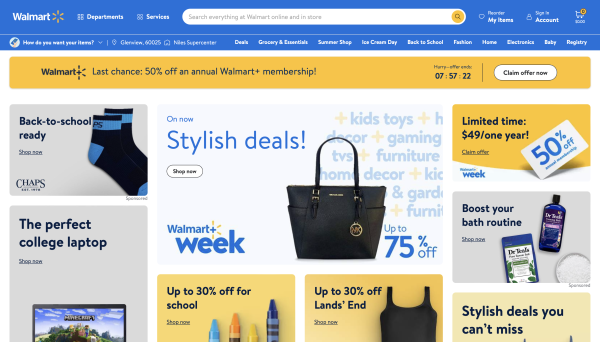
Walmart is one of the leading online marketplaces offering a one-stop shopping experience. The retail giant has prioritized convenience by streamlining the checkout process. Once you’ve selected the items you want to buy, you won’t be taken to a new checkout page. Instead, an on-page checkout sidebar allows you to complete your shopping without even signing up. A cart storage option saves your cart for up to three days if you forget to complete the checkout process or are distracted while on the site.
4. Nike
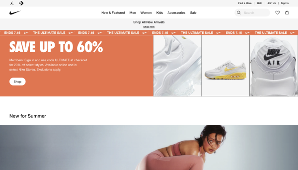
Nike is one of the leading sportswear companies whose success is rooted in simplicity and convenience. The same is reflected on its website, which prioritizes a minimalist design and easy navigation. Nike’s checkout process, for instance, is one of the simplest yet super interactive. If you enter the correct information during checkout, a green checkmark appears, allowing you to continue shopping.
There’s also an auto-fill address feature that saves you time during checkout. By simplifying the time-consuming steps and focusing on web design principles that boost conversions, Nike has successfully attracted and even retained more converting prospects.
5. Uber
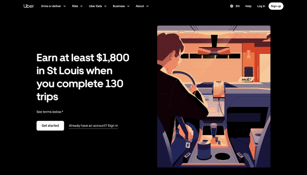
Uber falls into the category of companies that prioritize their homepage design, and it’s obvious why. Imagine landing on the Uber website and reading through needless copy, images, or videos before requesting your ride. Now think of a ride-sharing or service company that has made its home page simple, straightforward, and effective. You need to choose what you want, and you’re directed to the service almost instantly without going through the tedious sign-up process.
6. Wired
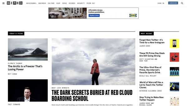
WIRED, a leading technology magazine and online publication, is among the many sites that have done a lot to improve the user experience. When you browse through the site using a PC or desktop, you’ll find multiple columns and a handy sidebar, but switching to your mobile transforms into a single column for smooth navigation.
The company also pays keen attention to details, such as adjusting image ratios to fit perfectly on each device. And for even more simplicity on mobile, they’ve combined search and newsfeed filter icons into one button.
7. Slack
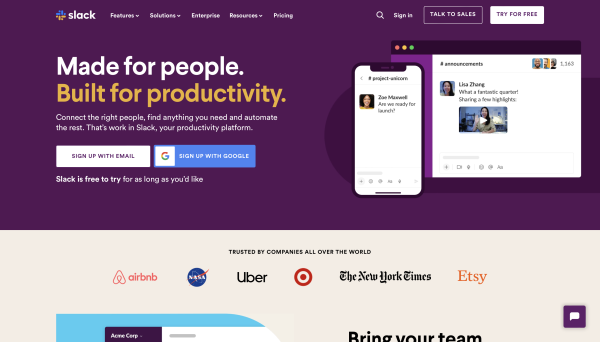
Slack is a business messaging app that’s been in the market for nearly a decade. The brand is known for its focus on simplicity, and they have successfully made it one of their competitive advantages. Slack has ensured that its site is easy to access and navigate, no matter the screen size of your device.
You’ll see customer logos in a neat three-column layout on a computer. But they have switched it to a single-column design on mobile phones for better viewing. And their call-to-action buttons? They span the whole column on tablets and mobiles, so you won’t accidentally click something else.
8. Shopify
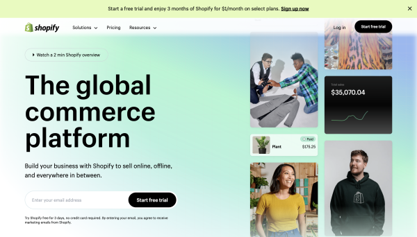
Shopify has built a reputation as one of the leading e-commerce website builders thanks to its robust features, comprehensive support, and intuitive user interface. The Shopify website is one of the few that has managed to strike a delicate balance between site consistency across devices and enhanced user experience.
If you access the official Shopify website from a desktop or phone, you’ll find that most things remain unchanged except for the CTA buttons and a few menus. Additionally, Shopify is among the few sites that enjoy impressive web page speeds despite using graphics-intensive image carousels.
Also Read: 3 Helpful Tips To Improve Your CTAs To Generate More Leads
9. IBM
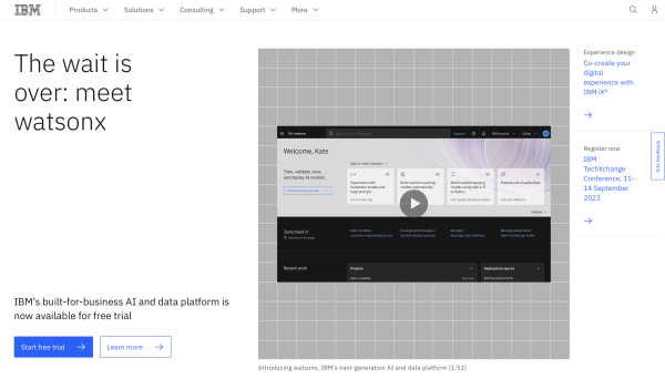
As one of the leading technology companies, IBM has set an excellent example for companies looking to create a fully-immersive site experience. The company has gone the extra mile to make its site not only responsive but also interactive, unique, and modern.
When you land on IBM’s homepage, you’ll be greeted with a responsive background, interactive videos, and a bold CTA. And while the IBM website is far from simple, it has incorporated complex design tools, from AI features to game-like functions, to create an immersive site experience.
10. Airbnb
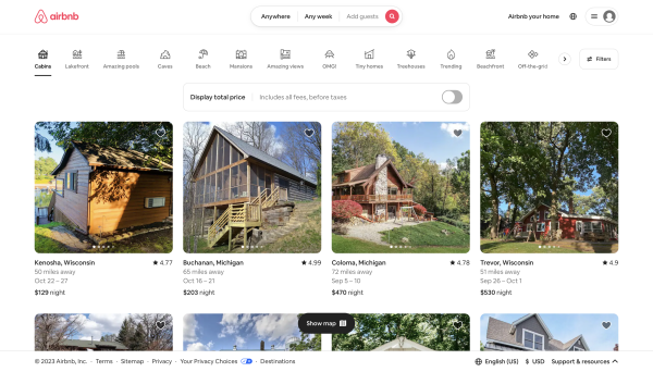
Airbnb uses some of the best design strategies, such as easy navigation, a consistent color scheme, and text minimization, to ensure user-centricity and enhance the customer experience. The homepage, for instance, displays lightweight graphics consisting of images and short, engaging videos.
All the media elements on the homepage have been carefully chosen to engage and convert without compromising site performance. The images of stunning rentals, from all across the globe, for example, create a sense of urgency and encourage site visitors to book their dream Airbnb.
Bottom Line
In today’s interconnected world, online presence significantly influences marketing, customer engagement, brand identity, and business growth. However, the discussed 10 examples of great website design emphasize that merely having an online presence for the sake of it is insufficient.
To truly make an impact, you must rethink every aspect of your online presence, considering not only how your website looks but also how customers can access, browse, and interact with it. Moreover, it is essential to incorporate these considerations into your digital strategy and plan regular updates to your website and its features.


