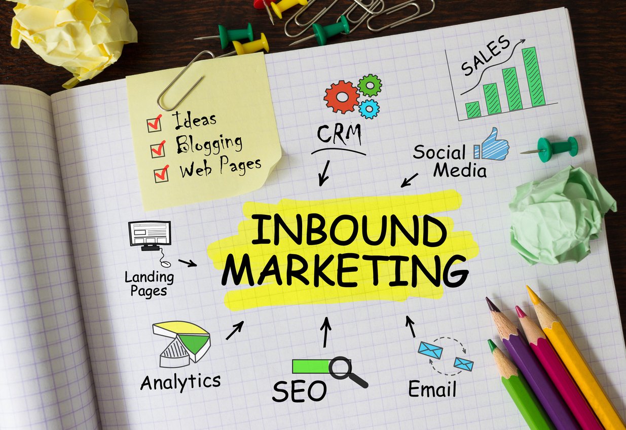
website redesign process

20 Tips To Improve Your Website Redesign Process

Your website is your audience’s first impression of your business and what you have to offer. Today more than ever you only get one time to make a first impression. With so much competition out there and so many advancements in technology your website needs to keep up with the technology changes and deliver fresh new content. An essential part of attraction marketing is drawing in the target consumer.

Time to Redesign Website

The website redesign process may seem to be a daunting task however a redesign doesn’t mean you have to completely overhaul your site. A website redesign can just be changing graphics, rearranging page layouts, or other small design functions.

Before you start your website redesign process you need to come up a strategy first. Without a strategic plan your redesign could end up costing you more and contain elements that are not consistent what what you audience wants to see. Your website is your single most valuable piece of marketing so spending time strategically planning out the redesign is extremely important to the overall success of your sales. Begin your website redesign process with a thorough evaluation of your business KPIs as a whole and take them to the next level.

The Website Redesign Process- Why Content Comes First?

20 Website Redesign Tips

1. Start with user testing to see what elements work for your users and which don’t.

2. Define the top three things you want to accomplish with your site.

3. Sketch out the new layout.

4. Go though the sales funnel of your site to see if it’s easy for a user to navigate.

5. Keep your conversion funnel as simple as possible.

6. Implement multiple lead capturing opportunities to grab your visitor’s email as much as possible.

7. Implement social media buttons prominently.

8. Have contact information be the easiest information to find on the site.

9. Select a color theme and typography that flows well together and maintain consistency on every page.

10. Keep call to actions limited to one to two per page.

11. Utilize motion in terms of layout and videos or image carousels.

12. Build a prototype of the new layout and have user testings performed before going live.

13. Think outside of the box by using disruptive imagery or bold colors.

14. Double check spelling and grammar- actually triple check.

15. Test all links and make sure they point people where they want them to go to.

16. Test site and mobile speed.

17. Make sure mobile site is user friendly and design elements maintain aspect ratios.

18. Optimize all of your pages for SEO and implement target keywords in page title, meta description, meta keywords, and page content.

19. Include some extra or fun pages. Users are expecting the standard contact, about us, and product/services pages. Make your website stand out with some fun or unique pages such as an FAQ page, a quiz page to match users to products/services, or industry pages that are directly relevant to users.

20. Incorporate testimonials.

  25 Website Must Haves For Driving Traffic, Leads & Sales

Social Network Social Media People Meeting Communication Concept

Social Media Campaigns for Attracting Prospects and Generating Leads

Becoming a part of the conversation in today’s evolving social world is not only a smart marketing tactic, it’s absolutely essential. It increases awareness of your brand, builds relationships, facilitates outside interaction, allows you to stay connected with your customers and leverage brand advocates, promotes your content online, and so much more. But how does it fit into an Inbound Marketing strategy? Read more

How to Improve Your Email Open Rate and Click-Through Rate

An email’s open rate and click-through rate are two metrics that can tell you a lot about the effectiveness of your email marketing campaigns. Additionally, they can be indicators of a company’s overall success. Understanding these two metrics allows you to measure how effectively emails are driving engagement and resonating with your audience. If your company’s emails are suffering from low open rates or low click-through rates, read on to learn how to remedy the situation.

email envelope

Open Rate

An email’s open rate is the percentage of people who opened it out of the total number of people it was sent to. What is considered to be a good open rate varies from industry to industry. A high open rate typically means that your email’s subject line is relevant and compelling, therefore enticing its recipients to open the email. Conversely, a low open rate typically means that your subject line is not catching your audience’s attention. If your emails have a low open rate, there are a couple of actions you can take to increase it. 

1. Redo Your Subject Line:

An email’s subject line is often what makes a consumer decide whether or not they are going to open the email. Therefore, it needs to be descriptive, and draw your audience in. The email’s subject line needs to be short enough to be displayed in full. Do not let the end of it get cut off. You should personalize the subject line by including the recipient’s name. Additionally, you should utilize A/B testing to identify what resonates best with your audience.

2. Make Yourself Known:

Consumers don’t want to open an email if they don’t know who it is from. Ensure that your email clearly shows it was sent from you by setting the sender name to your company’s name, rather than your company’s email address. The sender name should appear the same way on every email you send so consumers can recognize it.

Click-Through Rate

An email’s click-through rate is the percentage of people who clicked on a link in the email out of the total number of people who opened the email. Although they sound similar, an email’s click-through rate is not the same thing as an email’s click rate. Do not confuse the two. An email’s click rate is the percentage of people who clicked a link in the email out of the total number of people the email was delivered to.

Similarly to an email’s open rate, what is considered to be a good click-through rate varies from industry to industry. A high click-through rate typically means that your email is successful in persuading readers to take the desired action. The desired action can be making a purchase, downloading an eBook, signing up to attend a webinar, etc. Conversely, a low click-through rate likely means that your email’s call-to-action isn’t compelling, or that the email itself is not engaging. If your email has a low click-through rate, here are some ways you can increase it:

1. Make Your Email Visually Appealing:

Consumers often find cluttered emails to be overwhelming. Keeping your emails simple makes them visually appealing. Additionally, it makes your email more readable, and makes your call-to-action easier to find. Another aspect of making sure that your emails are visually appealing is making sure that your emails are mobile-friendly, since more and more people are accessing their email accounts on their mobile devices in this day and age.

2. Make Your Call-To-Action Clear:

Your call-to-action’s existence and purpose should both be clear. Visually, your call-to-action should be easy to find in your email. You can achieve a prominent call-to-action by using bold fonts and contrasting colors. In addition to being easy to find, your call-to-action needs to tell readers what to do. It should use action words like “watch,” “subscribe,” “read,” or “download” to guide readers on what they should do next. Using this kind of language consequently creates a sense of importance and urgency that motivates the email’s recipients to immediately engage and click on the call-to-action.

email marketing

Tracking, reviewing, and analyzing your email’s open rate and click-through rate are all essential to the improvement of your email marketing campaigns and therefore your overall company success. Use the 4 tips given above to increase your emails’ open rates and click-through rates.

3 ways to enhance your landing pages

3 Ways To Enhance Your Landing Pages

Landing pages are a great way to provide website visitors with helpful content, collect important customer information, and begin to build a relationship. They can be a great tool for generating leads for your business. But in order to convert visitors into leads, you must offer them something of value, and do so in a way that is easily navigable.

How To Improving Landing Page Performance

Here are a few easy ways to enhance your landing page performance.

Viewers should have a quick and clear understanding of the offer

People have very short attention spans, so in order to keep them on your landing page, it needs to be easily digestible within the first few seconds of viewing. Your message to your website visitors should be as clear and concise as possible. The headline should tell your visitors exactly what it is that you want them to do, and how to do it.

Using visuals to help communicate your offer can be helpful as well. Images should correlate well with the content offer, so viewers can quickly understand what it is they are accessing. For example, if you are offering an ebook, create a picture of the ebook or upload the ebook cover photo to the landing page. Good, descriptive images will make your offer more reliable, and will ultimately help convert more of your visitors into leads.

Also consider the value of your offer in what information you decide to collect. The higher the value, the more willing your visitors will be to provide information to you. This can help your company better understand your target audience.

Eliminate distractions on the page

People tend to be easily distracted, so you’ll want to make sure that there is nothing on your landing page that will deter them from providing their information and downloading your offer. It is important to remove the navigation bars and links from landing pages. While those are necessary on the home page, they can be detrimental to the success of your landing pages. At this point in the conversion process, you don’t want your visitors clicking back to a different part of your website and ignoring your offer.

Your landing page should have a strong focal point in order to enhance the clarity of the offer. Perhaps the focal point is your CTA that tells your visitors to download a white paper. Make sure that submit button attracts attention and is easy to click on.

Read More: 3 Helpful Tips To Improve Your CTAs To Generate More Leads

Include social sharing

Perhaps the only place you want your visitors to be able to navigate to from your landing page are your social media sites. Include social sharing icons so that your viewers can not only follow your social media accounts, but also so that they can share this offer to their own followers. Continuing your relationship with your visitors on social media is helpful to both your company and to them.

The success of your landing page performance depends on if they are formatted in a way that makes it simple for your visitors to digest and retrieve your offer. These tips will help convert your website visitors into leads, and further your Inbound Marketing efforts.

Are your landing pages ready to go? If so, find out how to continue guiding your leads through the Buyer’s Journey.

Inbound marketing will help you grow your business by attracting website visitors, converting them into leads and closing leads into customers
b2b branding

Using Your Brand Story To Reach Millennials In Business

Millennials are the largest generation in the workforce today and they’re taking on important leadership and decision-making roles. In fact, nearly half of all B2B researchers are Millennials.

As a group, Millennials change jobs much more frequently than previous generations. So every six months, you may find yourself having to reintroduce your brand to a whole new group of buyers.

How do you convey your brand’s core values and competitive advantages in the best light to reach this younger generation of buyers?

In order to connect your brand with today’s prospects and customers, make storytelling a part of your content creation and messaging. Effective storytelling not only captivates Millennials but also strengthens Brand Development by conveying your brand’s values in a compelling and meaningful manner.

Stories Are Memorable

A good story creates lasting impressions of your brand. Stories distinguish your brand from the competition, and consumers are going to remember emotion, characters, and conflict from a story longer than they will remember facts about your product or service.

To put it simply, if you tell a good story that emphasizes who your brand is and what your brand believes in, people will remember it.

Stories Are Easy To Understand

Brand stories are effective, because they inform in a format that readers already know and understand. Stories are made up of three basic components: beginning, middle and end. When developing a brand story, think about those components in terms of the past, present and the future. The past highlights the challenge or the problem that your brand set out to solve. The present showcases how you solve that challenge. And the future demonstrates your success and suggests continuation of that success moving forward.

Click here to learn what brand development is and how it works.

Stories Create Trust

Millennials are more likely to connect with a brand when they believe in that brand’s core values. When Millennials are researching a purchase, they are looking at dozens of different companies, each time wondering, “Why should I buy from you?” If you engage those buyers, and answer that question with a story that is built around your core values, then you’ve built an emotional connection and the trust of that customer. 

Stories Show Your Brand’s Personality

Is your brand fun and quirky? Serious? Hip? Thought provoking? Innovative? Intellectual? Dedicated? Whatever it is, your story should reflect that.

Your story should highlight your personality and showcase what is different and unique about your brand. It should demonstrate your values and what motivates and inspires you. This will bring your brand to life and create a human element that allows customers to develop an emotional connection to your brand through effective Brand Communication.

Stories Are Sharable

Strong brand stories will spread through social media. Enhancing your story with visuals and videos will expand the reach of your story and make it even easier for others to share.

Current research shows that 62 percent of Millennials are more likely to buy if a brand engages them online. Sharing your brand story will help build relationships between your brand and the growing group of Millennial buyers.

story branding

color psychology

How to Use Color Psychology in Marketing

When it comes to building your brand, don’t underestimate the importance of color. The colors you choose are crucial to your brand identity. Just think about some of the most famous brands out there and the colors associated with them, such as Nike and black, Starbucks and green, and Target and red, just to name a few. The colors you choose will always be associated with your brand, which is why you need to choose them carefully (and why they need to remain consistent across all of your branding efforts). One of the most important things to keep in mind is that color isn’t just an aesthetic choice, it’s a psychological one too.

The Power of Color: How to Use Psychology in Marketing

Using Color Intentionally

There are two primary ways to use color in your marketing efforts. The first is to make certain marketing elements stand out. For instance, adding a colored call-to-action button at the end of a blog post instead of using regular anchor text. If the button stands out from the background, it will immediately draw the eye of the reader so that they don’t miss out on your CTA.

The colors you choose for your website’s background and text is crucial as well. Not only does it impact the overall aesthetic of your website (which is important as it reflects on your company’s professionalism), but it also affects the ease of use. If you use two colors that are too similar (such as yellow text on an orange background) it becomes incredibly difficult for visitors to navigate your site. Your color choices should provide enough contrast so that foreground elements stand out from the background.

Finally, don’t overuse color. For example, choosing to use five different colors throughout your home page will create visual clutter that will overwhelm visitors. It works better if you choose no more than two colors that combine to create visual balance.

What Every Creative Advertising Agency Needs To Know To Endure The Digital Transformation

Using Color Psychology

Different colors elicit different feelings. By using certain colors, you can engage your audience by making them subconsciously feel a different way. Most successful brands choose their colors based on this idea. Take for example McDonald’s. As everyone knows, they use two colors: red and yellow. They complement one another aesthetically and are chosen for their psychological meaning. Red is often associated with friendliness, while yellow is associated with happiness, both of which are emotions McDonald’s embraced as a major part of their brand voice. Red also happens to be a very stimulating color that’s meant to trigger feelings of hunger. Combined, they attract attention from hungry customers.

Also Read: The Strategic Difference Between Branding and Marketing and How They Work Together

Color Breakdowns

All colors have some sort of effect on the psychology of consumers. With that in mind, the following are a few of the different colors you could use in your branding and the psychological meaning behind them:

  • Orange – Orange is associated with physical comfort, motivation, and positivity. Payless Shoes and Home Depot use orange as their primary color for these reasons.
  • Green – Green represents harmony, peace, health, and growth. Financial institutions use green to promote growth (of wealth), while many health products and stores use green to promote health (such as Whole Foods).
  • Blue – Blue is closely linked to trust and dependability. Many technology companies use blue to promote the idea that their products are dependable, such as Dell, GM, and Honda. Companies like Facebook and All-State also use blue to promote trust.website design


  • Brown – Brown is used to create feelings of trust and security. It’s why UPS prominently uses the color for everything, including their uniforms and trucks.
  • Purple – Purple is associated with luxury and royalty, which is why brands that promote their products as luxurious use purple, such as Cadbury, Hallmark, and Louis Vuitton.
  • Pink – Pink represents compassion, love, and empathy. Pepto-Bismol and Victoria’s Secret both use pink to this effect for different reasons.

Choose Your Colors Wisely To Improve Your Marketing Efforts

As you can see, the use of color is incredibly important to your marketing efforts. Not only do your color choices affect the aesthetic of your website (as well as its ease of use), they are also vital to defining your visual identity. As such, be sure to choose your colors carefully as they will have a psychological impact on your audience.

social media marketing