
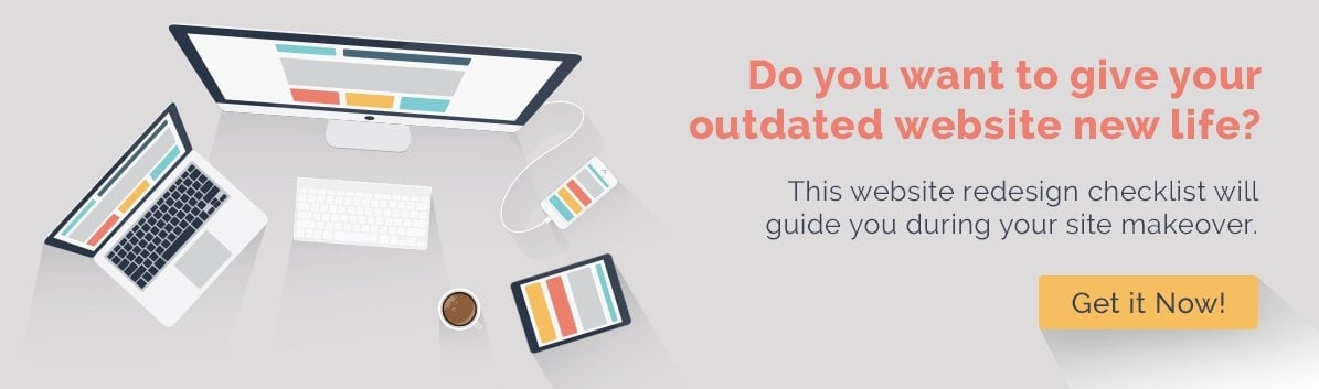
The Importance Of Having A Professional Web Design Service For Your Business
It doesn’t matter how big or small your company is, you need a website. If you don’t have a website, you’re without a doubt going to lose out on a lot of potential customers. This is because simply having a website is one of the most effective ways to generate awareness of your business. However, just having a website isn’t enough. You will want to have a professionally designed website to ensure that it’s technically sound, visually appealing, and user-friendly. While you might consider building your website yourself in order to save money, the following are a few reasons why it’s worth investing in a professional web design:
Importance of Professional Website Design Service For Your Business
1. Build A Unique Website
Building a website from the ground up is something few companies have the resources to do, which means that they end up using basic website templates. A professional website design service will be able to customize your website by tailoring it to your specific needs. As a result, you will be able to provide a unique website experience to your visitors that will help your business stand out. Additionally, they will be able to create a consistent aesthetic that accurately reflects your brand, thereby helping to strengthen your branding efforts.

2. Prevent Technical Issues
Professional web design services know what they are doing. They have massive amounts of experience and technical expertise. As such, when they develop websites, they ensure that there are no technical issues that will cause your website to crash or to function poorly. Even minor technical issues, such as slow loading times, can hurt your marketing efforts significantly. A technically sound website reflects positively on your brand as well. Additionally, a professional service can monitor your website for potential issues and address them before they have a big effect on your visitors.
3. Ensure Site Security
Website security is incredibly important. If you’re taking personal information from your visitors, such as their names and email addresses, then you have a responsibility to ensure that this data is secure. If you have an e-commerce page through which customers are providing their credit card information, then this is even more critical. A professional web design service will keep your website secure using all of the latest website security tools and practices, including HTTPS protocol.
4. Optimize Website For SEO
Optimizing your website for SEO (search engine optimization) involves a lot more than just throwing a few keywords in your content. A good website developer understands this and will build a site architecture that supports strong SEO. For example, they will build a site map that makes it easy for Google to crawl through your pages and to index them. Without an effective site map, search engines may miss pages when crawling through your website, which means that they won’t be ranked on their SERP (search engine results page). Additionally, proper keyword use in URLs, effective internal linking, and a lack of technical issues all contribute to good SEO.
Similar Article: 6 Web Design Principals to Increase Conversions
5. Update Your Website
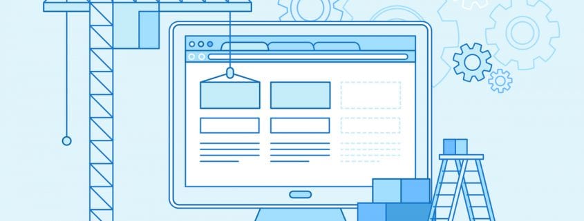
New technology is continually emerging, especially when it comes to websites. A brand new website can become outdated within just a year. A professional web design service can keep your website updated and implement new features that can improve the website experience over time. For example, it wasn’t that long ago that chatbots were first developed and now it’s not uncommon for a website to have one. Trying to add new features to your website on your own can be quite difficult and can cause issues with other parts of your site, which is why it’s best to let a professional do it for you.
6. Save Time
The amount of time that it takes to create a website cannot be overstated. Whether you’re building a website to completion or implementing a growth-driven design, it’s going to require a significant amount of time to do. Not to mention that the website will need to be regularly monitored and updated as well. By letting a professional web design service take care of your website, you will be able to focus your time on growing your core business.
7. Save Money
Many companies attempt to build their websites on their own because they think that they can save money this way; however, they’re more likely to lose money in the long run. Website design requires a lot of different skillsets, which means that you would have to take on more employees. Since running a website is a long-term strategy, these employees would have to be permanent. It’s more affordable to outsource to a professional web design service.
Ultimately, your website is a reflection of your business. If it’s of poor quality or appears unprofessional, potential customers will second guess the quality of your products or services. With that in mind, it’s worth investing in a professional web design.


 Improve your user experience


 The information should be simple, well-organized, and easy to understand. Visual hierarchy helps in content structure to ensure it’s logical and meaningful. This ensures that important information gets the most emphasis while less important information gets the least emphasis.